Android has a face only an engineer could love. At least, that's the reputation it has earned over the past few years. Google's mobile OS is a hotbed of mobile innovation and new technologies, but its interface doesn't have the friendly consumer-centric design of iOS or Windows Phone. With Android 4.4 KitKat, Google aims to address this shortcoming, while baking-in a handful of nifty new features.
But the plastic surgery is incomplete. While iOS7 is easily identifiable by its flat bright colors and lightweight fonts, and Windows Phone carries on with Live Tiles, the KitKat interface has no single recongnizable trait. Yes, it's flatter and brighter, but what isn't these days? Worse, the redesign seems pushed out the door too early. Scratch beneath the surface, and you'll find built-in apps and menus that haven't been udpated to the new look. There's a lot to like in Google's first name-branded OS release, but I can't help but this sweet treat isn't quite ready to be unwrapped.
A shiny, vibrant new interface
 The Notifications bar on KitKat is no longer a solid color and instead blends in with the rest of the screen, while the application drawer makes better use of the real estate.
Here it is, Android users: your newly polished, flatter interface. Google did away with the technophile neon blue-and-black color scheme and adopted a lighter, whiter palette that looks and feels friendlier and borrows some of its look from competitors like Windows Phone 8 and iOS 7.
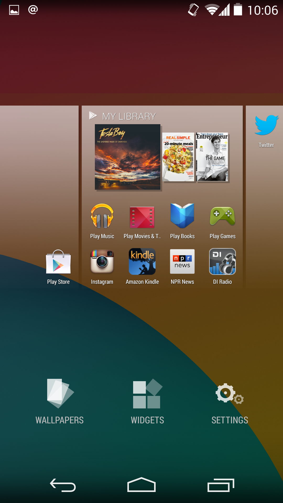 Select from wallpapers, place a widget, or tamper with the settings panel by holding down on the Home screen.
Though I only used it on the speedy quad-core Nexus 5, screen-to-screen transitions in KitKat feel smoother than in previous versions of Android, and icons are bigger and more detailed. Even the application drawer feels like a big breath of fresh air; you can no longer peruse through widgets or jump into the Google Play store from there. Now if you want to add a widget, all you have to do is hold down on the Home screen to bring up a menu that lets you add widgets, customize the wallpaper, and choose your launcher. This action feels more intuitive than past versions, which require that you dig through the application drawer to do anything to the Home screen besides change the wallpaper. It's a perfect example of Google's minor design improvements.
The rest of the interface remains seemingly untouched, however. The Notifications shade has new icons, but the Settings panel looks the same. Minor apps, like the Calculator or News & Weather, appear neglected. It's almost as if Google rushed through Android 4.4 in an attempt not to fall behind its competitors. Not that it will matter much, since only a small portion of Android users will get to experience the new interface in its native state. The vast majority will see whatever skin Samsung, HTC, or LG imposes on them.
 The Notifications shade features new icons, but overall it retains the same look as Jelly Bean.
If you've used the Chromebook Pixel, you'll notice that the interface is somewhat similar, a clear indicator that Google is moving toward a universal set of design guidelines to bind all of its products. For now, consider KitKat's new interface an introductory course into what's to come in Google's future.
"Here's what we're doing with your data"
KitKat really pushes Google's services on you, and desperately wants to collect your data, but it also makes it clear what it's collecting, how it's used, and gives you more options to opt out.
Android 4.4 features a new Locations panel that is more explicit about which apps are utilizing location services and for what purpose. From the Notifications shade, you can click through to the Location settings and choose, on an app-by-app basis, whether to allow Location services or not, and how your location should be determined. If you want more accuracy, you can combine GPS, Wi-Fi, and mobile network towers. If you want to save battery, turn off GPS. Or, use only GPS should Wi-Fi or mobile networks be unavailable. You can also peep which applications made recent location requests, as well as edit the individual Google location settings for any apps that make use of the data.
Notice, too, that the Settings panel remains dressed in Jelly Bean's dark interface, and it doesn't really match up with what the rest of KitKat has going on in the design department.
 KitKat offers more information about how Android and other apps are using your location.
The Google Settings application first introduced in Jelly Bean is stuffed with more options. Now you can check up on your advertising ID, a semi-permanent alpha-numerical tag attached to your Google account to let the company know which ads to push out to you. You can also opt out of interest-based ads and control the ones that are delivered to you, and when you tap on those options Android will point you to Google's official FAQ on the matter.
 Find out what else is going on with your information from the Google Settings app.
Google has certainly taken a step forward by offering a separate settings panel for your Google account, but they're difficult to parse, and it's unfortunate that they're sequestered away from the device's main Settings panel. It would have been better if Google could somehow tuck these options under the Accounts section of the regular Settings panel, keeping everything in a single logical location.
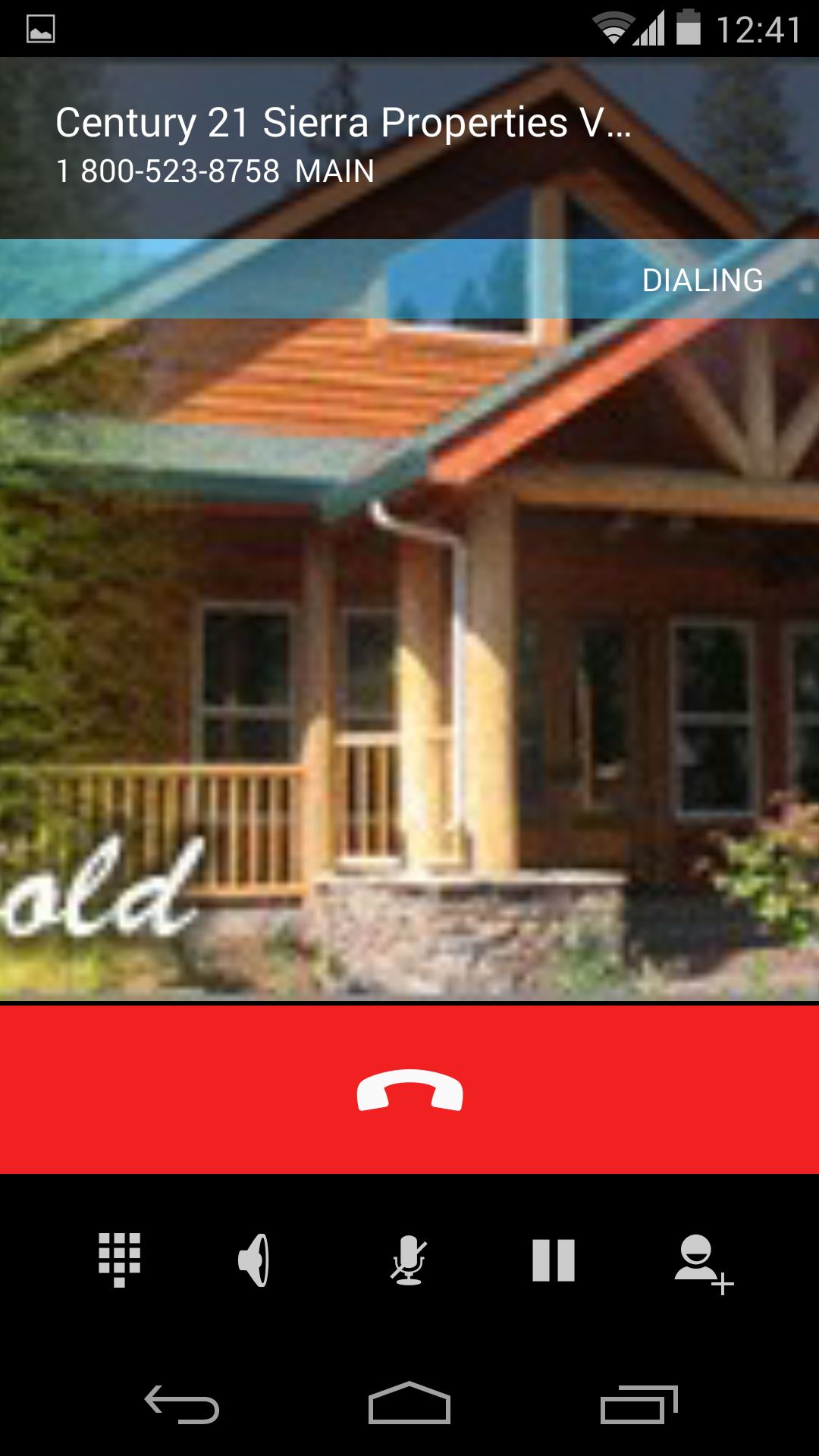
The oft-forgotten Dialer
We've reached the point where the phones in our pockets are so far removed from the phones of yesteryear that updates to the app that actually makes phone calls are worthy of praise. In KitKat, Google dedicated resources to an application that is often forgotten on other platforms, pegging the dialar as a marquee feature.
 Android 4.3's Dialer app is plain and simple, but 4.4's aims to be a little more contextual.
The Dialer app sports the new interface and opens with your favorite contacts front and center, as well as your recent calls, instead of that boring grid of numbers. Google has finally acknowledged that we rarely make calls on our phones by dialing numbers on a keypad. Thankfully, Google made it easier to search through your contacts by name, making that ability the first thing you see.
 Once you press send to call a business, you'll see Caller ID pop up.
You can also look up places of business based on a search term. It didn't work too well for me in the beginning, but after a few tries it managed to eventually bring up places related to my inquiry. The screen can get crowded with information, though, when you're just trying to call a friend or family member. When I typed in "Mom," it also brought up the numbers for the parking garages near the San Francisco Museum of Modern Art ("MOMA"). I don't like the long listing of extra numbers, but at least the information was useful.
The Caller ID function works, too, but an image will only show up if the business or person has a Google+ profile. The interface for this function also looks like it reverts back to Jelly Bean, as evidenced by its black options bar.
Beginning early next year, Google will also show you the Google+ profile for incoming calls—even those who are not in your circles—essentially turning the app into a full-fledged phone directory. It's clear that Google wants you to use its social networking service for connecting with others. Whether this will translate into more true Google+ users remains to be seen, though the company is certainly trying to convert Android users into Google+ users.
Google Now, now, now!
In KitKat, Google Now resides in its own Home screen panel, similar to the way BlinkFeed takes up a panel on the HTC One's Sense UI. To get to it, all you have to do is swipe over all the way to the left—or you can shout at your device, “Okay, Google.” You'll have to wake up the screen for this to work; Google didn't just give the whole world the MotoX's best feature.
Google Now continues to be Android’s strongest feature. In KitKat, you can customize it without waiting for the Cards to pop up by scrolling down to the very bottom and tapping the wand icon. You can input your favorite sports teams or stocks, set up your most frequented Places, and choose your preferences for everything else, like when other Cards should appear.
There is also a dedicated Reminders panel that lists past, present, and upcoming reminders, and you can easily add one through voice or text input.
The more tightly integrated Google Now is more than a gentle nudge to use the service for all of your searchable needs. Google is almost forcing you to gravitate toward it now that it's a part of your Home screen.
 Peer into the settings and you can customize Google Now to your liking, without waiting for Cards to pop up.
The new features in Google Now may possibly see their way over to other versions of Android in a future update, but for now these enhancements are only available on KitKat.
It's the little things
I’ve always appreciated Android's little things—the minor enhancements that you don’t normally read about in an advertising campaign, and the things you don’t realize are there until you start digging for them.
 Tap and Pay and Google's Cloud Print services are now an integrated part of the Android operating system.
Just as was rumored, Google integrated its Cloud Print services directly into the Android operating system. You can now access the printer settings from the Settings panel and print documents to any cloud-enabled printer. You can also use Google Cloud Print to save a document to Google Drive.
Then, there is the Tap & Pay feature, which works with the Google Wallet app and lets you do things like pay for groceries where NFC is supported. It is also available from the Settings panel, though you don't actually set anything up within that screen, but in the seperate Wallet application.
Frequent readers will also appreciate that Google now offers the ability for some of its applications to run in full-screen mode. The next time you're engrossed in a new novel, your mother's text messages won't distract you.
 KitKat now features an easy-to-use Fullscreen mode for apps like Google Books.
Google also improved the step detector and step counter platform within KitKat, though you won't really notice the benefits until third-party developers start implementing it into their applications.
KitKat is pretty good
From its list of features, KitKat sounds tasty, and Android 4.4 is certainly a step in the right direction. Its interface is bright and inviting and the newly added secondary features like Cloud Print integration and a new Dialer application should help make stock Android even more consumer friendly. You also have top-level access to Google+ and Google Now, so there's no excuse not to take advantage of Google's most hottest features.
A lot of popular phones will get upgraded to KitKat in the next couple months, though Google has stated that the voice-activated search and some Home screen features will remain exclusive to the Nexus 5 for now. Hopefully by the time KitKat makes its way to your device, Google will have tied up some the loose ends—adopting the new design in all of its core apps and consolidating the myriad of new settings. Or, it can continue to torture us like it did with Jelly Bean by making only incremental changes to the entire Android package with each release, spacing out core app updates by months.
Subscribe to the Best of PCWorld Newsletter
Thank you for sharing this page.
Sorry! There was an error emailing this page
Similar Articles: alabama football politico brandon jacobs Kelly LeBrock VMA 2013
No comments:
Post a Comment
Note: Only a member of this blog may post a comment.